Dom
Budownictwo
Multimedia
Wnętrza
Ogród
Nieruchomości
Dom
Budownictwo
Multimedia
Wnętrza
Ogród
Nieruchomości
Impregnat do drewna na zewnątrz – jak wybrać produkt odporny na deszcz, słońce i mróz?
Jak ściany przeciwpożarowe chronią budynek, nie szpecąc wnętrz?
Precyzja co do milimetra – narzędzia pomiarowe, które uratują Cię przed kosztownymi błędami podczas remontu
Budownictwo
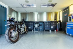
Szafki warsztatowe – niezbędny element wyposażenia każdego warsztatu
Czy warto wybrać buty robocze sportowe?
Czym wyróżnia się firma Caterpillar?
Dom
Płyta laminowana czy metal – z czego wykonuje się solidne biurka dla graczy?
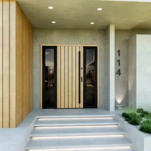
Poszukujesz drzwi do swojej inwestycji? Najlepsza oferta w Małopolsce.
Podstawowe porady dotyczące utrzymania czystości w łazience
Multimedia
Czym jest szybka pożyczka bez odmowy?
Jak zabudować pralkę i suszarkę w łazience lub kuchni
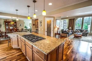
Praktyczne rozwiązanie kuchenne
Ogród
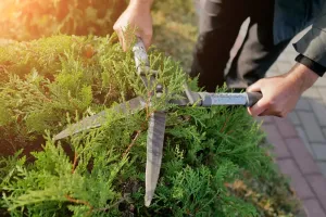
Jak zapobiec brązowieniu igieł roślin iglastych – wskazówki i porady
Czym cechują się obrzeża ogrodowe?
Plac zabaw w ogrodzie
Wnętrza
Dlaczego warto mieć plisy okienne w swoich pomieszczeniach ?
Klasyczny styl we wnętrzach domu
Piękne wnętrza w stylu glamour
Potrzebujesz więcej informacji?
NAPISZ DO NAS